Limited Spots This Month: Get a FREE CRO Video Audit + Action Plan. → Claim Now
Limited Spots This Month: Get a FREE CRO Video Audit + Action Plan. → Claim Now
Limited Spots This Month: Get a FREE CRO Video Audit + Action Plan. → Claim Now
Limited Spots This Month: Get a FREE CRO Video Audit + Action Plan. → Claim Now
Limited Spots This Month: Get a FREE CRO Video Audit + Action Plan. → Claim Now
 Book a Free Call
CRO and landing pages for Shopify
Revenue per visitor from a bundle block on the product page.
Artem Straps+17.9%Revenue per visitor from one honest stock check at checkout.
Artem Straps+14.6%Revenue per visitor from a new advertorial headline.
BSQBlog
Checkout Is Where Trust Is Won
A checkout teardown of Highwire. How an open order summary, a clear origin line, and fewer fields help more shoppers finish what they started.
October 15, 2026
The last step is where people hesitate
By the time a shopper reaches checkout they have found a product, chosen it, and decided to pay. It is tempting to think the job is done. It is not. Checkout is where the shopper hands over a card number and an address to a brand they may have found an hour ago. Any small doubt at this point turns into an abandoned checkout.
Highwire makes clean, design-focused products and charges a flat $5 shipping fee. The brand is built in Oakland. Those are good details. The current checkout does not use them.
What the current checkout shows
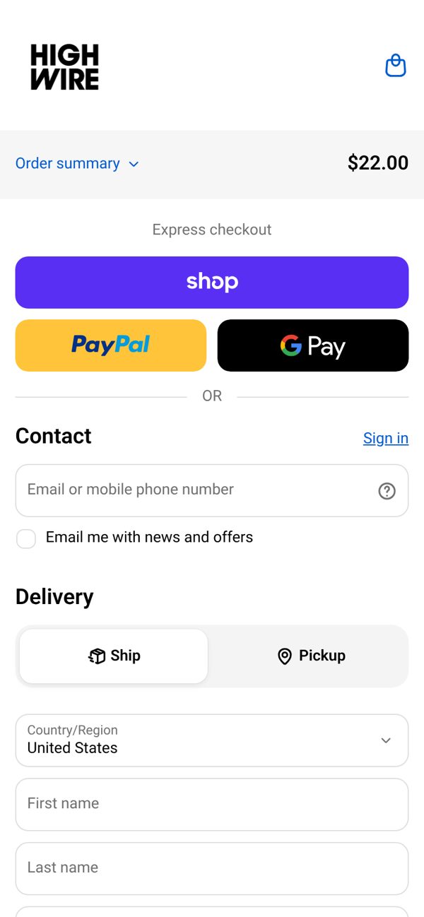
On mobile, the live checkout has a common layout:
- The order summary is collapsed behind a small link, so the shopper cannot see what they are paying for without tapping.
- There is no mention of where the brand is from or who stands behind it.
- No clear secure checkout label near the payment fields.
- A long form with more fields than the order needs.
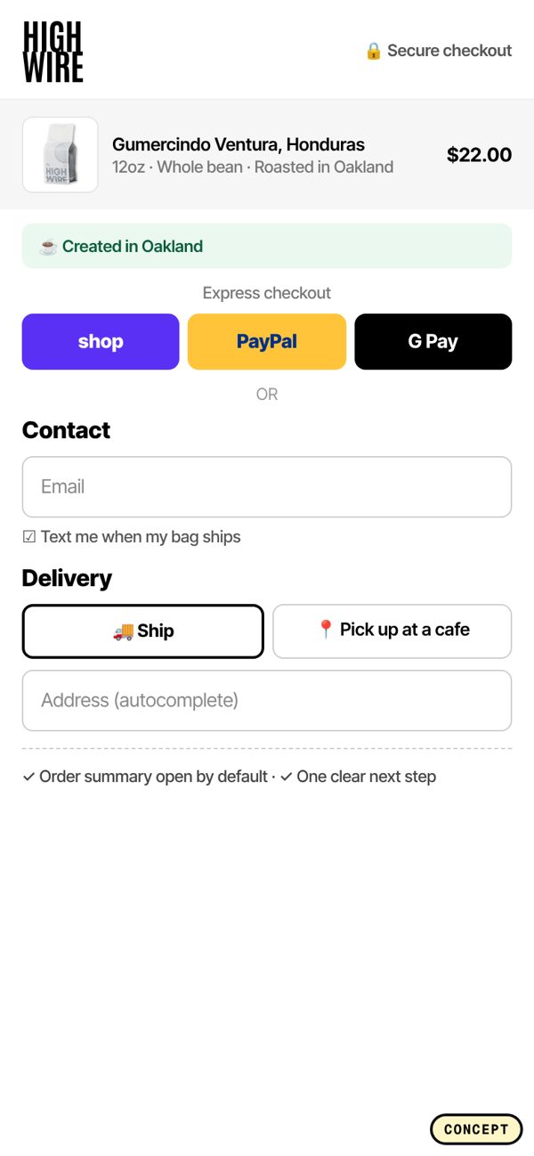
What we changed in the concept
- Order summary open by default. The shopper sees the product, the price, and the $5 flat shipping without tapping anything.
- A Created in Oakland line. One short sentence near the top that tells the shopper there is a real company behind the store.
- A secure checkout label. A small lock and a plain line near the payment section.
- Fewer fields and address autocomplete. Only ask for what you need to ship, and let the address fill itself.
The test data behind it
These are the checkout patterns we used, with the lift reported in past A/B tests:
- An upsell at checkout: +11.4%.
- Unique selling points above the fold: +4.5%.
- Unique selling points inside checkout: +2.1%.
- A delivery estimate near the order total: +2.1%.
Checkout lifts are often smaller than product page lifts, but they apply to your hottest traffic. A 2% gain on people who already started paying is real money, and it adds up across every order.
Show people what they are paying for
A collapsed order summary saves space, but it also hides the one thing a shopper wants to double check before paying. If they have to tap to see it, some will not, and they will feel less sure. On mobile, an open summary with a small product image, the price, shipping, and total is enough. It does not need to be big. It needs to be visible.
A real company behind the store
Shoppers buy more easily from people than from logos. A single line like Created in Oakland, a founder name, or a short note on who packs the orders makes the store feel real. It costs nothing and takes one line of space. It works best near the top of checkout, where the shopper first lands.
Every field is a reason to quit
Each extra field is one more thing to type with a thumb. Ask only for what you need to ship and charge the order. Use address autocomplete so the shopper types a few letters and picks their address. Put the email first so you can recover the cart if they leave.
If you sell to returning customers, make sure Shop Pay or a saved login fills the form in one tap.
Upsells at checkout, carefully
An upsell at checkout can lift order value, but it has to be small and relevant. One low priced add-on that pairs with what is in the cart, with a single tap to add, is the right size. Anything that looks like a second shopping trip will hurt more than it helps.
Make delivery timing clear
A delivery estimate near the order total answers the question many shoppers have but rarely ask: when will this arrive? A simple line like Arrives in 3 to 5 business days removes a small doubt right where it matters. If you offer a flat shipping fee, like Highwire's $5, say it plainly and early so nothing changes at the last step.
How to audit your own checkout
Go through your checkout on a phone as if you were a first-time buyer:
- Can you see what you are paying for without tapping?
- Is shipping cost clear before the last step?
- Is there any sign of who runs the store?
- Is there a secure checkout label near the card fields?
- How many fields do you have to fill? Could any go?
- Is there a delivery estimate?
Fix the visibility issues first, since they cost nothing. Then cut fields. Then test a small checkout upsell.
The short version
Checkout is where trust is won or lost. Show the order, show who you are, show that payment is secure, and ask for as little as possible. The design does not need to be exciting. It needs to remove every reason to hesitate.
If you want us to review your checkout and the rest of your funnel, book a free CRO audit.
Concept only, not affiliated with Highwire. Screenshots are of the public site and our own redesign concept.