Limited Spots This Month: Get a FREE CRO Video Audit + Action Plan. → Claim Now
Limited Spots This Month: Get a FREE CRO Video Audit + Action Plan. → Claim Now
Limited Spots This Month: Get a FREE CRO Video Audit + Action Plan. → Claim Now
Limited Spots This Month: Get a FREE CRO Video Audit + Action Plan. → Claim Now
Limited Spots This Month: Get a FREE CRO Video Audit + Action Plan. → Claim Now
 Book a Free Call
CRO and landing pages for Shopify
Revenue per visitor from a bundle block on the product page.
Artem Straps+17.9%Revenue per visitor from one honest stock check at checkout.
Artem Straps+14.6%Revenue per visitor from a new advertorial headline.
BSQBlog
Your Cart Is a Sales Page Too
A cart teardown of Made By Mary. How a slide-out drawer, a free shipping bar, and one-tap add-ons turn the cart into the best sales page on the site.
October 12, 2026
The cart is not a receipt
Most stores treat the cart like a receipt. It lists what you picked, shows a subtotal, and points to checkout. That is a missed chance. The cart is the one page where every visitor has already said yes to at least one product. They are warm. They trust you enough to start buying. It is the best moment on the whole site to raise order value and remove the last doubts.
Made By Mary is a good example. The brand sells personalized jewelry and has more than 48,000 five-star reviews. Returns are handled through Redo. Those are strong reasons to buy, and the current cart does very little with them.
What the current cart does
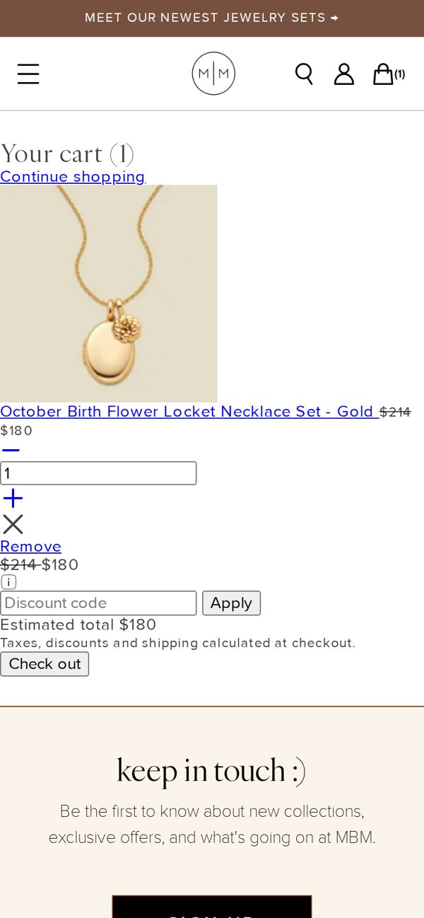
On mobile, adding a product sends the visitor to a separate cart page. It shows the item, the price, and a checkout button. That works, but it:
- Pulls the visitor away from the product they were looking at.
- Gives no reason to add a second item.
- Does not mention the reviews, the return policy, or delivery timing.
- Does not show how close the visitor is to any shipping or gift threshold.
What we changed in the concept
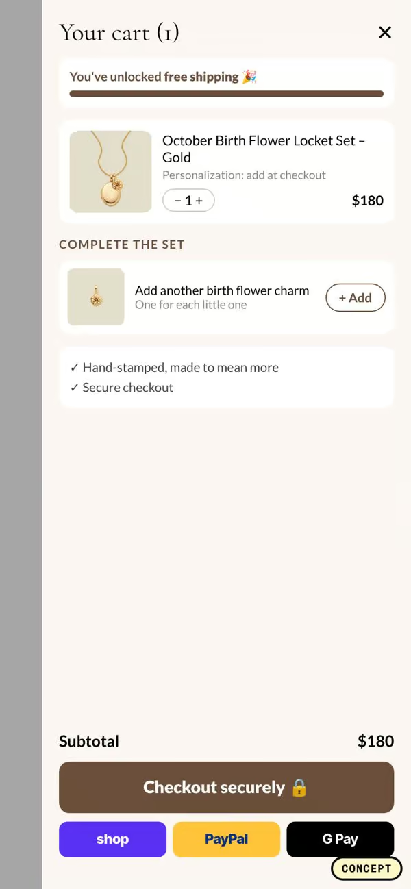
- A slide-out drawer instead of a page. The cart opens over the product page, so the visitor can check their item and keep shopping without losing their place.
- A free shipping bar. A simple progress bar at the top shows how much more the visitor needs to spend to unlock free shipping.
- Complete the set. Matching pieces appear right under the item, with a one-tap add button. A necklace suggests the matching earrings or bracelet.
- Express pay. Shop Pay, Apple Pay, and similar options sit under the main checkout button for people who want to finish fast.
- Trust in the cart. The review rating and the easy returns line appear near the checkout button, where the last doubts show up.
The test data behind each change
These are the cart patterns we used, with the lift reported in previous A/B tests:
- One-tap add-ons inside the cart: +34.7%.
- Showing savings as a dollar amount, like Save $34: +11.9%.
- A cart drawer instead of a cart page: +10.4%.
- Unique selling points in the cart: +3.8% to +14.9%.
- A rating shown in the cart: +3.8%.
- A delivery estimate in the cart: +2.1%.
The biggest number on that list is the one-tap add-on, and it makes sense. A visitor who just picked a necklace is the perfect buyer for the matching earrings. Make adding them one tap, with no extra page and no size picker, and many will do it.
Why a progress bar works
A free shipping bar gives the visitor a goal and shows them how close they are. It also gives them a reason to look at the add-ons right below it. When we screenshotted the cart drawers of 15 top DTC stores, 8 of them showed a progress bar toward a reward. Some used free shipping, some used a free gift. The pattern is common for a reason.
Keep it simple. One goal, one bar, one line of copy that says how much is left. If you have two rewards, show the next one only.
Dollar savings beat percentages on small items
When a bundle or a set saves money, say how much in dollars. Save $34 is easier to feel than Save 20%, especially on items under a hundred dollars. The visitor does not have to do math. It is also more honest, because they can check it against the line items.
Put the trust where the doubt is
Most stores show reviews and return policies on the product page and forget about them by the cart. But the cart is where the visitor is about to spend money, and that is when doubts come back. Will it arrive in time? Can I return it? Is the quality good?
A short trust line under the checkout button answers those questions in one glance. For Made By Mary that line can mention the 48,000+ five-star reviews and easy returns. For your store it might be free returns, a delivery date, or a guarantee.
How to audit your own cart
Add a product to your cart on a phone and look at what you see:
- Does the cart open as a drawer or send you to a new page?
- Is there a reason to add one more item?
- Can you add a suggested product in one tap?
- Is there a progress bar toward free shipping or a gift?
- Are reviews, returns, or delivery timing mentioned near checkout?
- Are express pay options visible?
Each gap is a test. The one-tap add-on and the drawer itself are usually the biggest wins, so start there.
The short version
Treat the cart as a sales page, not a receipt. Keep the visitor on the product with a drawer, give them a goal with a progress bar, make the matching item a one-tap add, and repeat your strongest trust points next to the checkout button.
If you want to see how 15 top DTC brands design their cart drawers, from Ridge to Olaplex to Bombas, we put them side by side in a free breakdown with a checklist you can use on your own store.
Concept only, not affiliated with Made By Mary. Screenshots are of the public site and our own redesign concept.